recu.
Where fashion finds a second life and new style finds its first home.
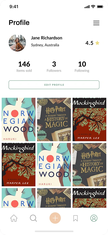
We built recu for people who see fashion as expression, not consumption, where pre-loved pieces find a second life and new style finds its first home. A buyer discovers curated listings on a visual feed, messages the seller, bookmarks favourites and buys with confidence, while a seller photographs an item, prices it, tags it and watches it find the right wardrobe. One app, two sides of the same closet.
Warm, curated, effortless
recu looks the way a well-organised closet feels. Muted sage greens and warm peach tones set a calm backdrop that lets the fashion do the talking, with no visual noise and none of the usual marketplace clutter. Every screen earns the user's attention through restraint, which is exactly what a fashion product needs: the clothes should be the loudest thing on the page, not the interface.
Every screen tells a story.
From the profile to a listing, the create flow, the chat and the alerts, each screen is designed to feel like part of one calm, considered experience rather than a collection of separate marketplace tools bolted together.


A marketplace that feels like a lookbook.
 01
01Visual product feed
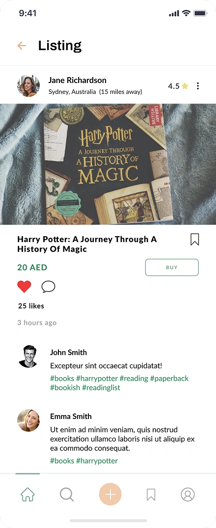
A card-based grid leads with photos, prices, seller ratings and category filters, so you scroll it like a magazine and shop it like a marketplace. The feed is built to make browsing pleasurable rather than transactional, because in fashion, discovery is half the experience.
 02
02Seller dashboard
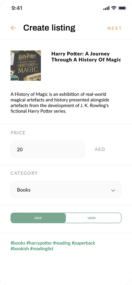
Sellers upload photos, set prices, tag categories, track sales and manage inventory, with a listing going live in under two minutes. The dashboard is fast and clear, because a marketplace lives or dies on whether sellers can list easily and keep coming back.
 03
03In-app messaging
Conversations are tied to specific listings, with real-time delivery and push notifications, so a buyer and seller can negotiate and finalise without ever leaving the app. Keeping the conversation in context, attached to the item, is what makes the deal feel safe and simple.
 04
04Social features
Users can follow each other, wishlist items, and get notified about deals and new listings from sellers they trust. These social touches turn a one-off purchase into a reason to return, which is how a marketplace builds a loyal community rather than just traffic.
Browse, buy, sell
Three actions that cover the entire marketplace experience.

Browse the feed
Scroll a visual grid of listings filtered by category, price and condition, and tap any card to see the full product story. Discovery is designed to feel relaxed and visual, not like searching a database.

Chat and buy
Message the seller directly from the listing, ask about condition, negotiate, and finalise the deal without leaving the app. Everything stays in one place, tied to the item being discussed.

List in minutes
Snap a photo, set the price, pick new or used, add tags and publish, and the listing is live and searchable immediately. Making listing this quick is what keeps sellers active and the feed fresh.
Cross-platform speed, server-side reliability
Flutter delivers a native-feeling iOS experience from a single Dart codebase, which kept the build efficient without compromising how the app feels in the hand. A Laravel backend on MySQL handles the listings, messaging, notifications and real-time inventory sync. The phone handles the polish, and the server handles the reliability that a live marketplace depends on.
Mobile
Backend
Design meets function.
Hover each card to reveal how we solved it.
Editorial feel without losing marketplace function
The interface had to feel editorial without sacrificing marketplace functionality. Buyers expect a visual, scroll-friendly feed, sellers expect fast uploads and clear analytics, and both had to coexist on the same app without it turning cluttered.
We designed a card-based feed that puts product photography first, with each card showing the image, price, seller rating and distance at a glance, and a detail page that expands into a full product story with comments, tags and a buy button. Sellers get a separate dashboard with sales tracking and inventory management, so each side gets the experience it needs without crowding the other.
Real-time inventory across every device
Inventory had to update in real time across every device. When a seller marks an item as sold, every buyer looking at that listing needs to see it disappear instantly, because stale listings erode trust in a marketplace faster than almost anything else.
The Laravel backend pushes inventory state changes through real-time events, so when a listing sells, every client viewing it receives the update within seconds. The same pipeline handles price changes, new comments and status toggles, keeping every user's view of the marketplace honest and current.
Seamless buyer-seller communication
Buyers and sellers had to communicate seamlessly without leaving the app. Negotiations, questions about condition and shipping details all needed to happen in one thread tied to the listing, rather than spilling over into email or a separate chat app where context is lost.
We built an in-app messaging system tied to each listing. A buyer taps the chat icon on any product and the conversation opens with the listing context already attached, while sellers see all their active threads in one inbox sorted by recency. The deal stays in one place, with the item always in view.
Questions before the first stitch.
It depends on scope, but as a guide, a marketplace app like recu in the Netherlands typically runs from around EUR 25,000 to EUR 60,000 or more, depending on features such as messaging, payments and real-time inventory. We give a fixed estimate after a short discovery call rather than quoting blind.
For most marketplace apps, Flutter is a strong choice because one Dart codebase delivers a native-feeling experience and keeps build and maintenance costs down, which is what we used for recu. Pure native makes sense when an app leans heavily on platform-specific hardware or extreme performance, and we advise honestly on which fits your case.
The backend pushes state changes as real-time events, so when a seller marks an item sold, every buyer viewing it sees it update within seconds. In recu the same pipeline handles price changes, new comments and status toggles, which keeps listings current and protects the trust that stale listings would erode.
By tying each conversation to a specific listing. In recu, tapping the chat icon on a product opens a thread with the listing context already attached, with real-time delivery and push notifications, and sellers see all their threads in one inbox. Keeping chat in context, rather than in email, is what makes deals feel safe.
At minimum: a visual product feed with filters, a fast listing flow for sellers, listing detail pages, in-app messaging, and real-time inventory. Social touches like following and wishlists help retention. We help prioritise a focused first version that proves the marketplace works before adding everything at once.
A focused fashion marketplace like recu typically takes around four to six months from concept to launch, depending on the depth of messaging, payments and social features. We work in two-week sprints with working software throughout, so progress is visible rather than going quiet until launch.
By designing the whole interface around it. In recu, product photos lead every card and expand on the detail page, and the calm, restrained design keeps the focus on the item. We also make the seller upload flow fast and simple, because good photography only helps if sellers can actually add it in seconds.
Yes. recu handles both, letting sellers mark an item as new or used and buyers filter by condition. Supporting new and pre-loved side by side is built into the listing and filtering from the start, which suits a fashion marketplace where second-life style sits next to first-home pieces.
Planning a marketplace or e-commerce app?
We build mobile marketplaces that handle listings, messaging and real-time inventory. Tell us about your concept and we will scope it out.